Why Do I Keep Getting Lost in My Clinic Portal Menus?
In today's healthcare landscape, many clinics and GP surgeries have embraced digital portals to deliver services—especially video consultations and online booking. These tools promise convenience: no more travel, no waiting room discomfort, and the ability to book or check test results from your sofa.
Yet, as useful as these patient portals can be, many users report frustration: endless menus, confusing links, and difficulty finding important documents or messages. While remote healthcare removes the hassle of physical travel, it does not replace the need for clear assessment, guidance, and human connection.
The Allure—and Pitfalls—of Remote Consultations
Video consultations are often celebrated as a breakthrough. Instead of a stressful trip to the clinic, you can meet your GP on your phone or laptop. Booking appointments online should be swift—secured in seconds via smooth screens.
But the convenience of remote access can mask the challenges beneath. Care quality isn't just about speed; it's about ensure the right processes happen, including thorough clinical assessment and appropriate follow-up. If a portal’s focus is on quick bookings rather than guiding you properly through your healthcare journey, you might get lost.
Example:
Imagine you book a video consultation because of persistent headaches. You complete the booking quickly through the portal’s online screen. But later, when trying to find prescription details the doctor mentioned or accessing follow-up advice—perhaps test results—you're faced with a maze of menus. You wonder, “Where is that message my doctor sent? How do I find my referral letter?”
Too Many Menus: A Common Portal UX Problem
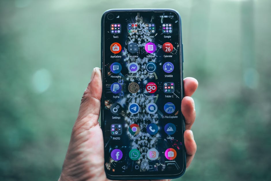
Patient portals often have multiple layers and menu items. You might see tabs like “Appointments,” “Test Results,” “Messages,” “Prescriptions,” and “Health Records.” But these can be fragmented or poorly labelled. Worse, some portals bury essential functions several clicks deep.
This complexity can lead to:
- Confusion: Forgetting where you saw a document or message.
- Frustration: Struggling to complete simple tasks like renewing prescriptions.
- Missed Information: Overlooking critical updates or advice from your clinician.
Moreover, not all portals are designed with accessibility in mind. Less tech-confident patients—older adults, people with disabilities, or those less familiar with digital tools—can find portals intimidating or inaccessible, increasing the techonthego.co risk they disengage from their care.
What Happens When Something Goes Wrong?
If you can’t find important information or can’t book follow-up appointments easily, you may delay necessary care or resort to calling the clinic repeatedly. Yet many portals do little to highlight how to reach a human for help conveniently. Instead, they lean heavily on automated menus and FAQs, which don’t always address individual user needs.
Booking Speed Is Not the Same as Care Quality
A slick booking flow is tempting to focus on, but it doesn’t guarantee quality care. The process should also:

- Provide clear information about what will happen during a video consultation.
- Warn patients if a face-to-face appointment might be necessary based on symptoms.
- Guide patients on any documents or preparation needed before the consultation.
Some portals try to speed up booking at the expense of context or guidance. This can make patients feel rushed or unsure if they’ve chosen the right appointment type.
How Portals Should Guide Next Steps and Offer Human Help
The best patient portals do more than just list services and documents. They serve as a healthcare companion, helping you understand what to do next and how to get support if needed.
Feature Why It Matters Example Clear Signposting on Dashboard Shows you what actions are pending or upcoming. "You have a video consultation scheduled tomorrow at 3pm. Prepare by having your medication list ready." Easy Access to Important Messages Ensures that clinicians' advice and test results don't get lost. A "Messages" tab with unread message alerts and clear sorting by date or topic. Human Support Options Visible Gives reassurance and a fallback when technology is confusing. A “Contact a receptionist” or “Speak to a nurse” button visible on every page, with clear phone numbers and email addresses. Accessibility Features Makes the portal usable for all, including those with visual or motor impairments. High contrast modes, simple language options, screen reader compatibility.Accessibility: Designing for Everyone, Not Just the Tech-Savvy
Healthcare should be inclusive. Patient portals must consider users who may lack experience with digital devices or have impairments. Designing with accessibility means:
- Using simple, jargon-free language.
- Offering tutorials or guided tours of portal features.
- Providing alternative channels for those uncomfortable with the portal.
- Ensuring the visual layout is clean, with clear fonts and button sizes.
Remember, if a patient can’t easily navigate the system, they may avoid seeking help, risking their health.
Finding Documents and Messages in Your Patient Portal
One of the most reported pain points is struggling to locate important clinical documents such as test results, referral letters, or messages from your healthcare team.
Here are practical tips to help you:
- Check for a “Messages” or “Inbox” Tab: This is often where clinicians will send personalised advice.
- Look Under “Health Records” or “Documents”: Test results and letters may be stored here as PDFs.
- Use Search Features: Some portals include search bars—try keywords like “blood test” or “referral.”
- Bookmark Important Pages: If the portal allows, mark frequent spots to save time later.
- Don’t Hesitate to Contact Support: Look for a clearly visible helpline or email especially if you cannot find vital information.
Summary: What to Expect and Demand from Your Clinic Portal
While modern patient portals are essential tools to access remote healthcare, they can sometimes create obstacles rather than simplify care. If you find yourself lost in too many menus or unsure how to find key documents, remember the following principles:
- Speed without context is not enough. Booking screens should provide guidance and preparation.
- Portals must be designed with real patients in mind, including those less confident with technology.
- Human support must always be easy to find and reach.
- Clear, simple menus and consistent labels help reduce confusion.
- Accessibility features make the portal usable for the broadest possible audience.
Next time you open your clinic portal and feel stuck, take a moment to explore if there is a “Help” button or a way to speak to a staff member before giving up. Good portal design should guide you smoothly to the care you need—not leave you wandering lost in a maze of menus.